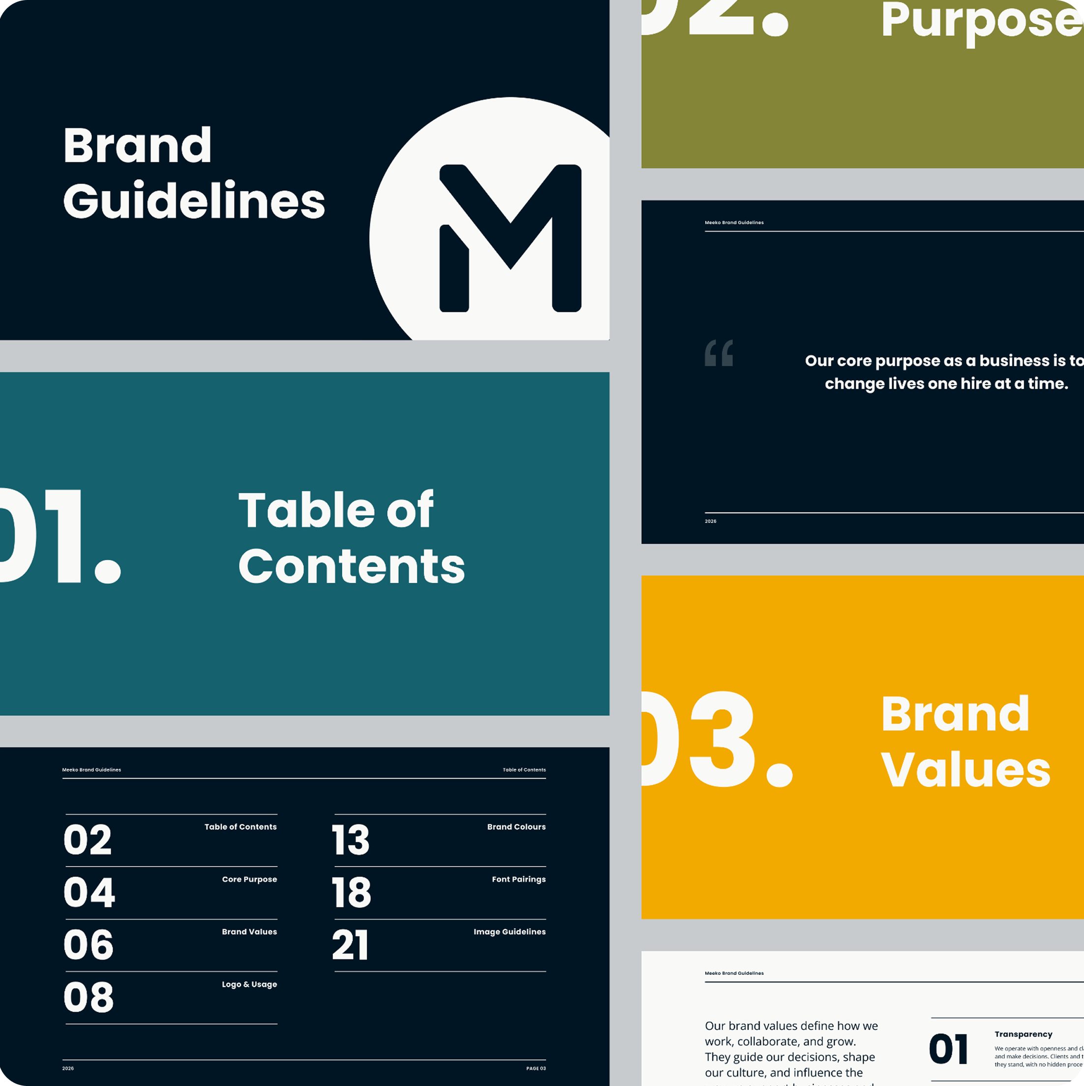
The project focused on building a structured and scalable brand identity system based on both strategy and visual consistency:
Brand Strategy & Positioning: defined the core purpose and brand values to establish a strong foundation for all visual and communication decisions.
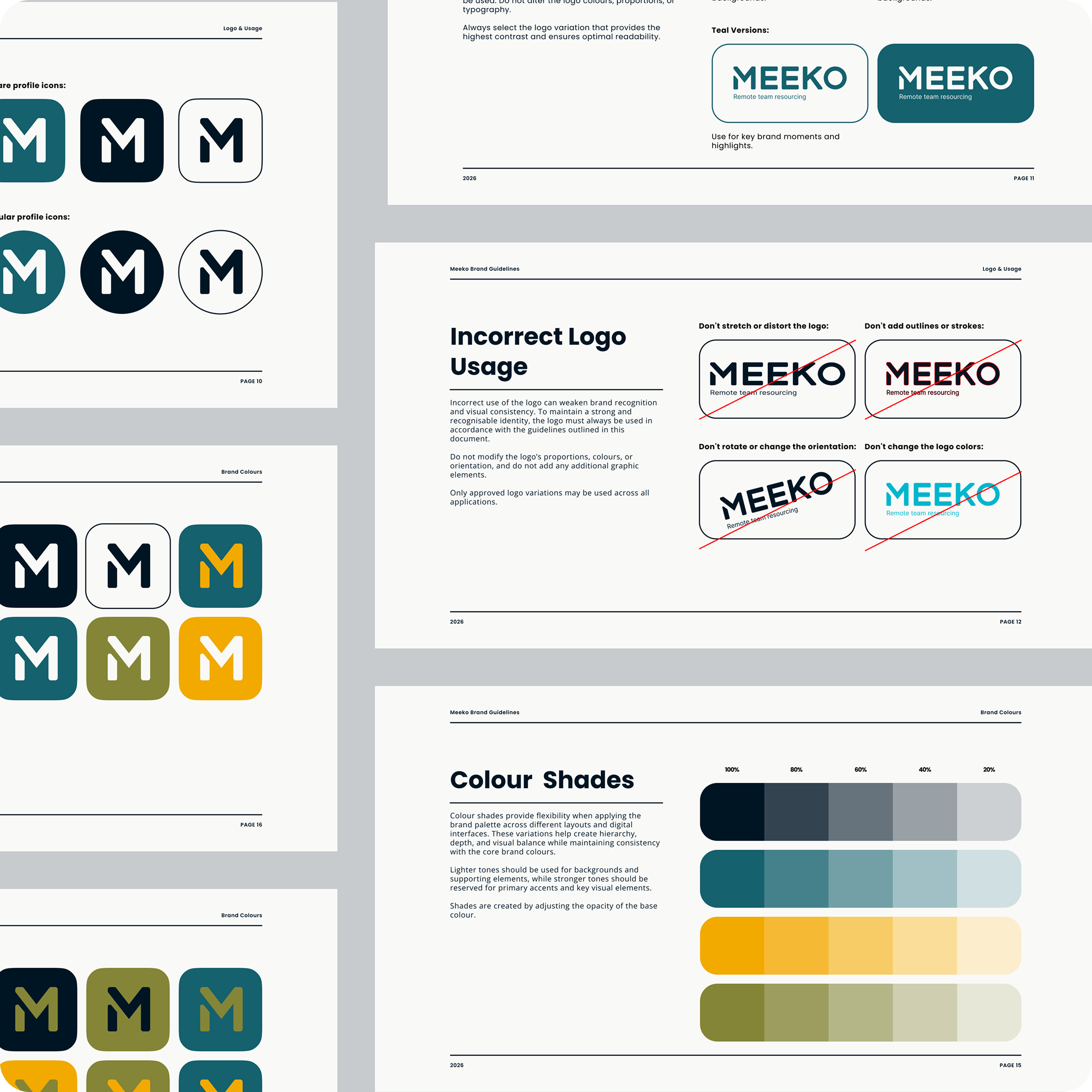
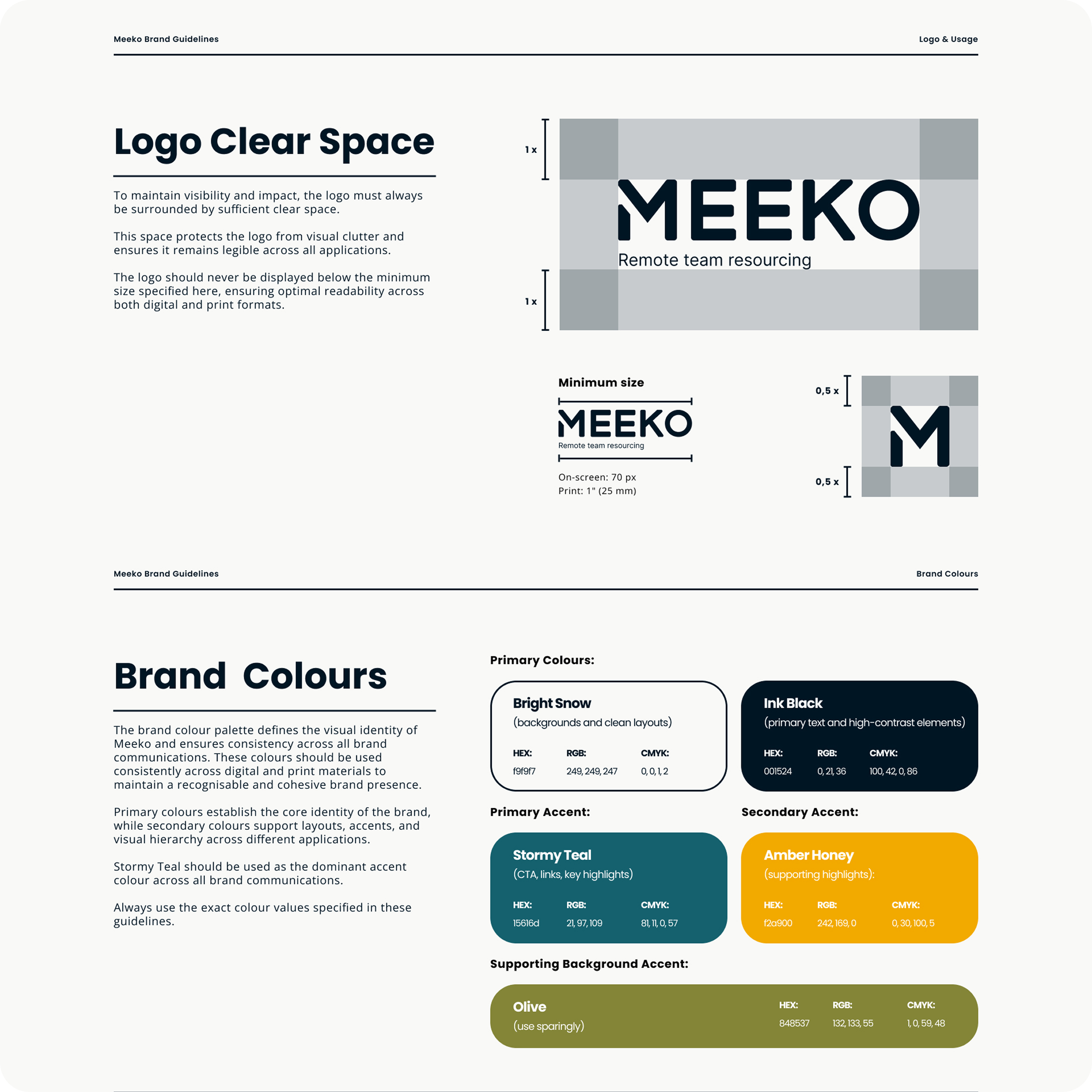
Visual Identity Development: designed a clean and modern logo system with clear rules for usage, spacing, and variations to ensure consistency across all applications.
Colour System: created a balanced and flexible colour palette, including primary, secondary, and accent colour, ensuring strong contrast and visual hierarchy.
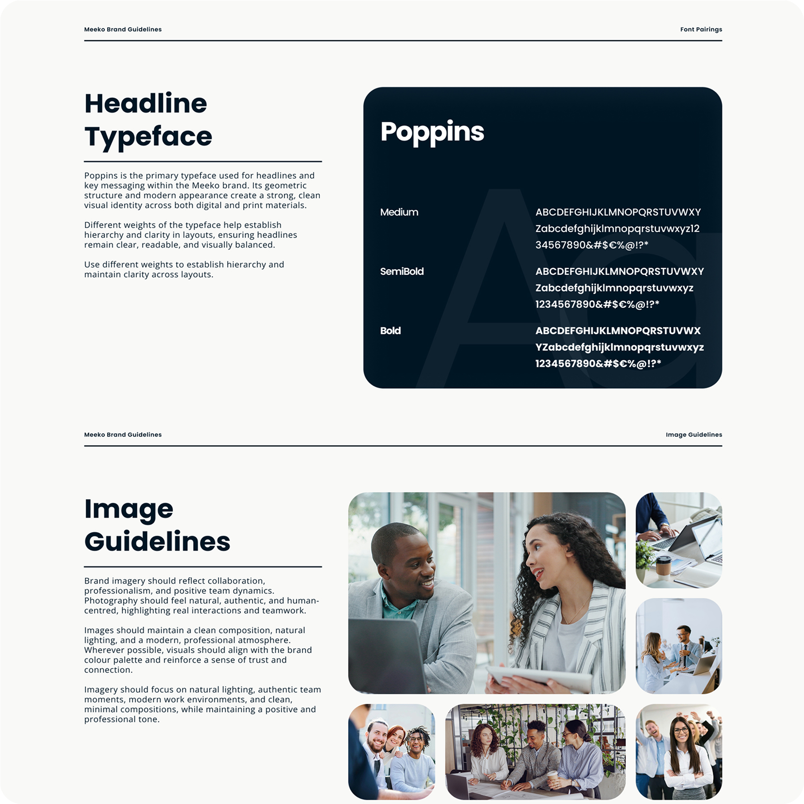
Typography System: defined a clear type hierarchy using Poppins for headings and Open Sans for body text, improving readability and structure across all materials.
Image Direction: established guidelines for imagery focused on authenticity, collaboration, and real team interactions to reinforce brand values.
Brand Guidelines: developed a comprehensive brand book that provides clear instructions on how to apply all visual elements consistently.